John Lewis - Part 2
4 November 2021
View this email in your browser

Subscribe to this service to benefit from our world class insight.
Could our advisory and consultancy services help you?
Key Takeaways - John Lewis - 2nd visit - Part 2 (JLP = John Lewis partnership)
1) As noted; Christmas is near spectacular in store and a superb example of what the rest of the categories should seek to do. It's not easy though. The 'every day' category is just that and consistency is hard to find. Alas the principles around 'speaking the customer's language' (get your tree Insta ready, for example) whilst John Lewis understand that John Lewis exists to provide solutions and inspiration for customers would be a great start, applied to for every single category.
2) Lighting is a great category to look at in this regard, not necessarily huge footfall as lighting isn't an everyday purchase. However, components within can be (IE lightbulbs). It becomes a destination category in the sense of customers looking at John Lewis for inspiration alongside other retailers for their lighting needs, so range, information and presentation are everything. John Lewis had nothing.
3) Anyday continues to baffle everyone. However, this wasn't necessarily down to the range/branding in this case, it was rather some poor retail execution that ultimately meant a 20% off promotion was too complex and just confused the customer.
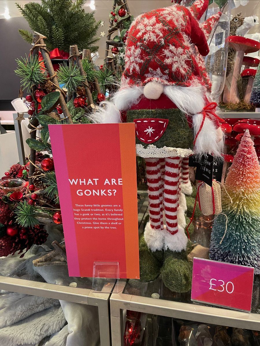
For part 2 - we start at Gonks. Good, informative signage around these characters, no less.
The informative signage, clear pricing and product all worked well and this is a great example of where John Lewis get it right around big events, such as Christmas. Introducing new lines that are traditional in other countries is a great way to drive trade, especially where their festive ranges are so well themed.
Scandinavia is a big inspiration for their work this Christmas with some really impressive work that we'll cover later in this note.
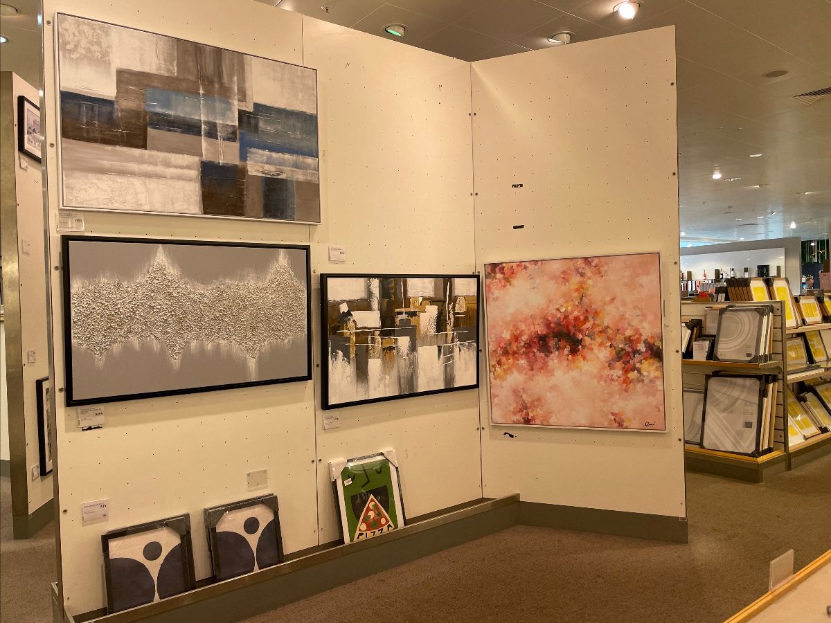
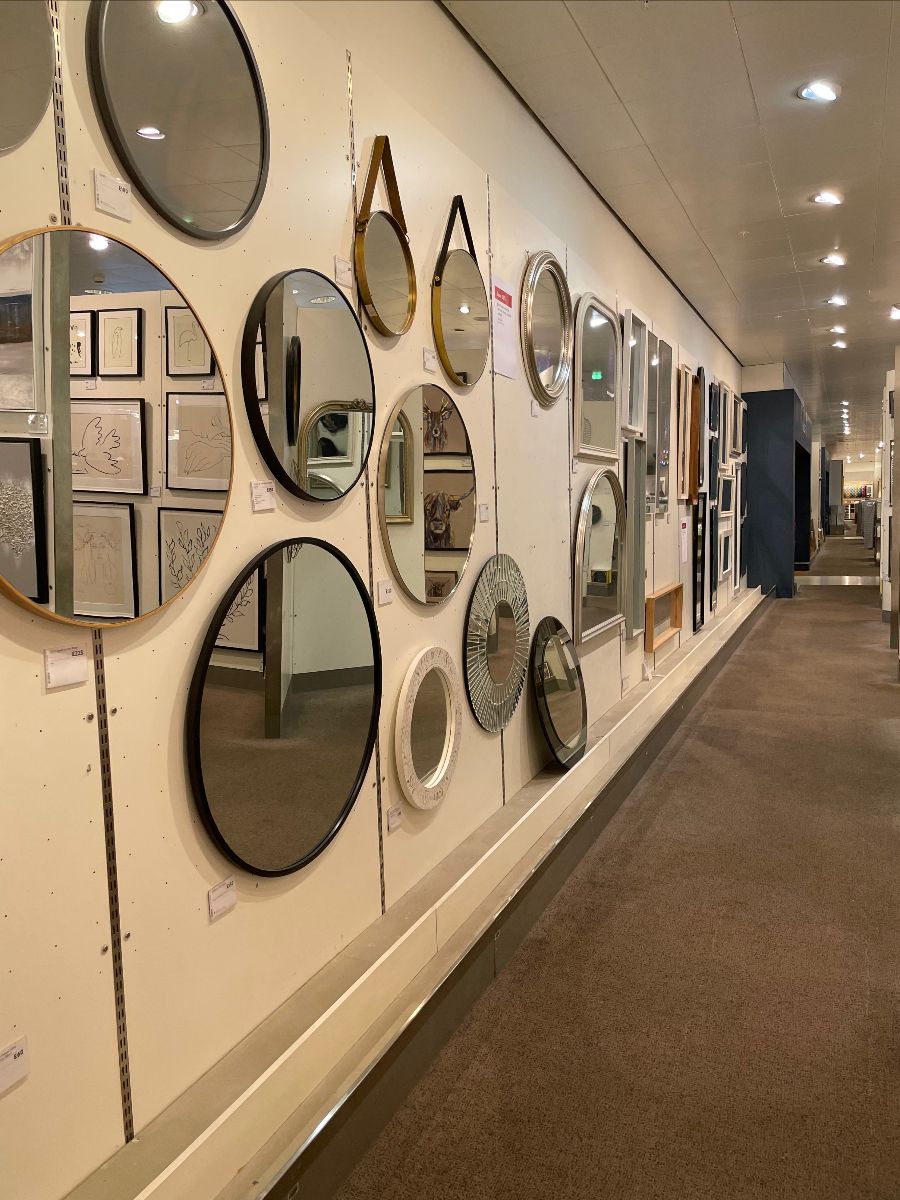
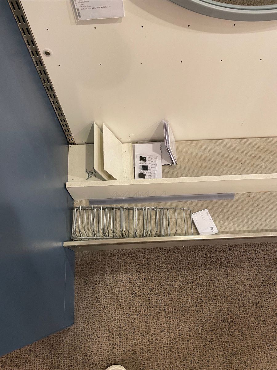
Before Christmas -
We have what looks like a 6th form art project that has been installed in the main bank of John Lewis, near the Lighting category and not a million miles from the store entrance, either......
This houses their mirror/frame/art based collections, complete with old shelf labels and other pieces of equipment that have been left in the base for some time.
The display kit was old and that was an issue, but the entire area needed a clean and a reset. Gaps on the display/range didn't look great and the inspiration was hard to come by. How can anyone visualise any of these products in their home?
It's almost like a display of art by local producers; IKEA, for example does a far stronger job and at easily half the price, if not more.
Forget Anyday bridging the gap. This is where the comparatives are drawn by customers to other retailers, looking at equivalent ranges and displays too. The John Lewis offering looks equivalent to that of IKEA (eg) because it's displayed so poorly, without excitement, vigour or indeed belief.
Thus when the prices are reviewed by customers, they're surprised (not in a positive way) at the price gap between John Lewis and IKEA (eg) and that impacts value perception. Primarily because the range doesn't look great in store, nor does it look different enough.
Nor does it look like John Lewis are proud of it either.
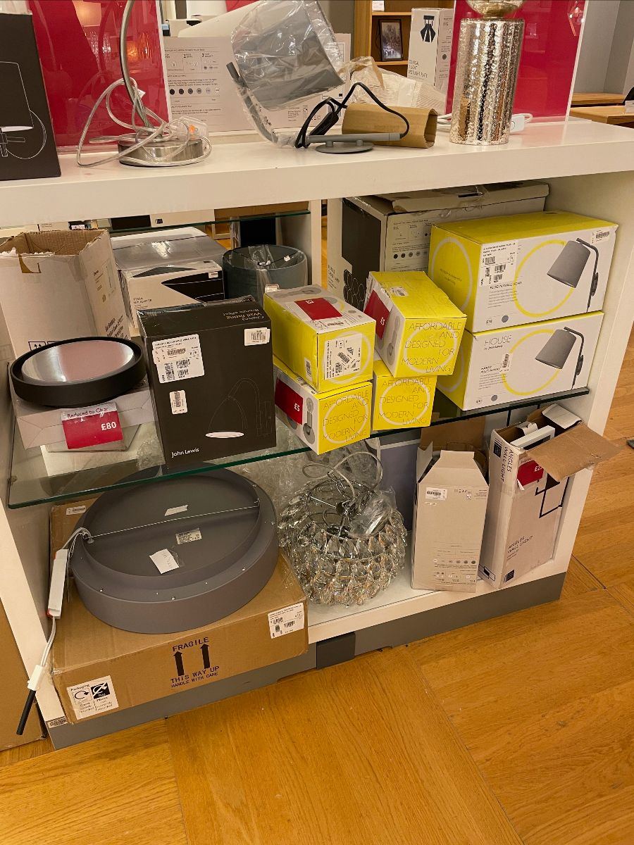
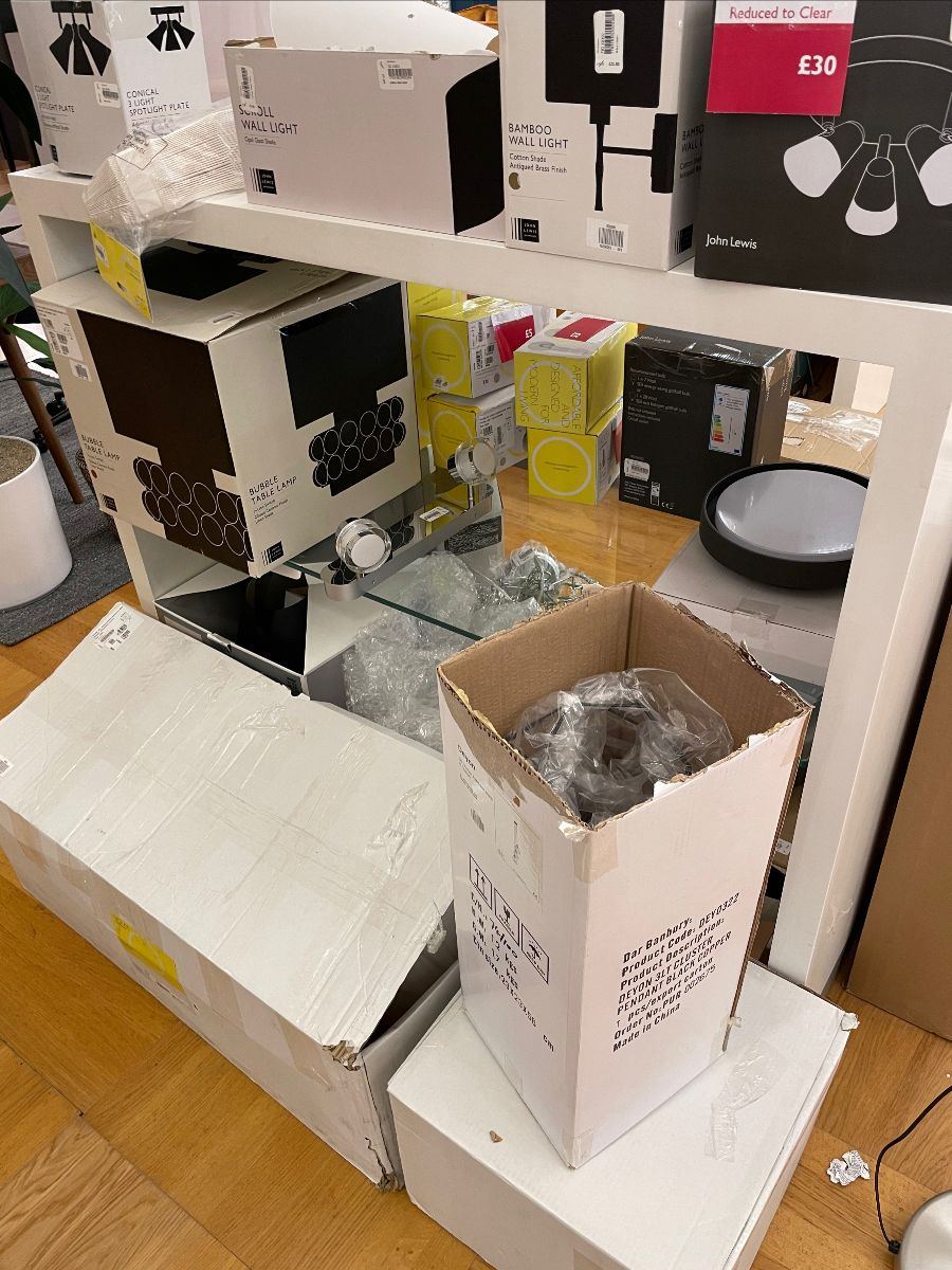
There wasn't much pride in Lighting; we included similar pictures yesterday, there were so many.
Real issues here and this badly needed sorting out; there was easily an opportunity to turn this in to an eco based reuse story for customers. Focusing on trying to reuse product that was perhaps damaged or missing a component.
This would be merchandised together in store with product from all categories included; it certainly would be more of a focal point than this retailing horror show.
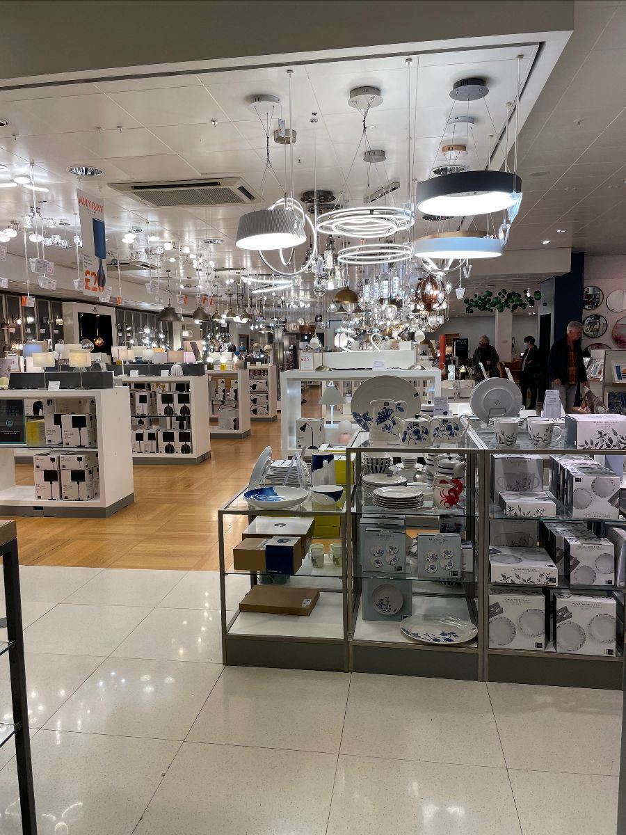
As for the Lighting category itself.....
Ironically, the store lighting overhead was uneven which cast a shadow across the range, with lots of hanging lights that were imposing and the path to purchase wasn't clear enough.
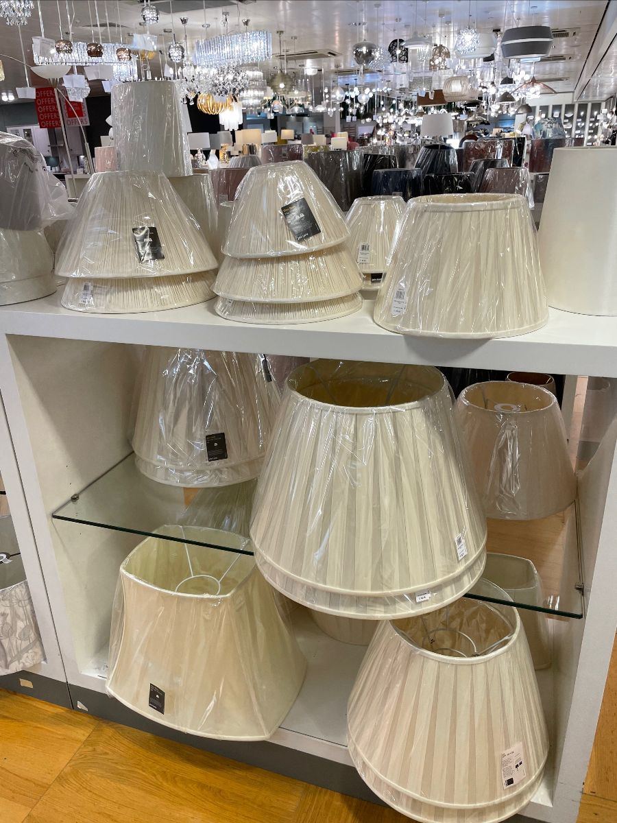
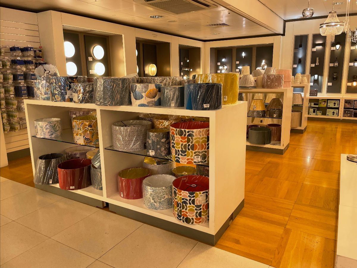
We all appreciate how difficult it can be to sell Lampshades, but this didn't feel like a great use of display space, nor was it overly effective.
Lots of plastic was the first impression, given the outer packaging remains in situ (a difficult balance when facing in to plastic reduction) but even the basic shades are hard to get 'right'.
Just no inspiration - you'd be forgiven for thinking I'd shared a picture from somewhere like Allders in the late 90's.
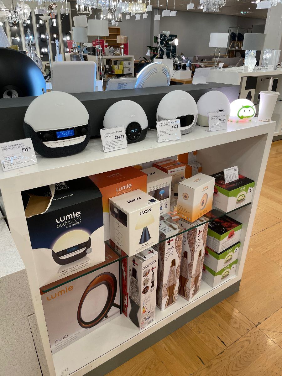
The image above is a great example of the buying team merchandising products based on who the buyer is, rather than how customers would buy in real life.
This activity can't be replicated on a spreadsheet, it's can only be done in a real life store.
Clearly, because these alarm clocks provide artificial light. They are merchandised within lighting, despite their mission bring very, very different. It's not a light, it's an alarm clock that uses light, rather than sound.
It makes no sense to expect a customer to be wading around lighting, hoping they'll stumble upon the alarm clocks that utilise artificial light. It just Isn't how people shop, at all.
Another pointer - it's a big miss for signage and general product guidance I feel. There is no real explanation around the differing products and their benefits when considering purchasing to alleviate SAD (seasonal affective disorder) for example and which products are suitable / give off a stronger light etc.
It's an opportunity missed.
Provide leadership in each category to help customers.
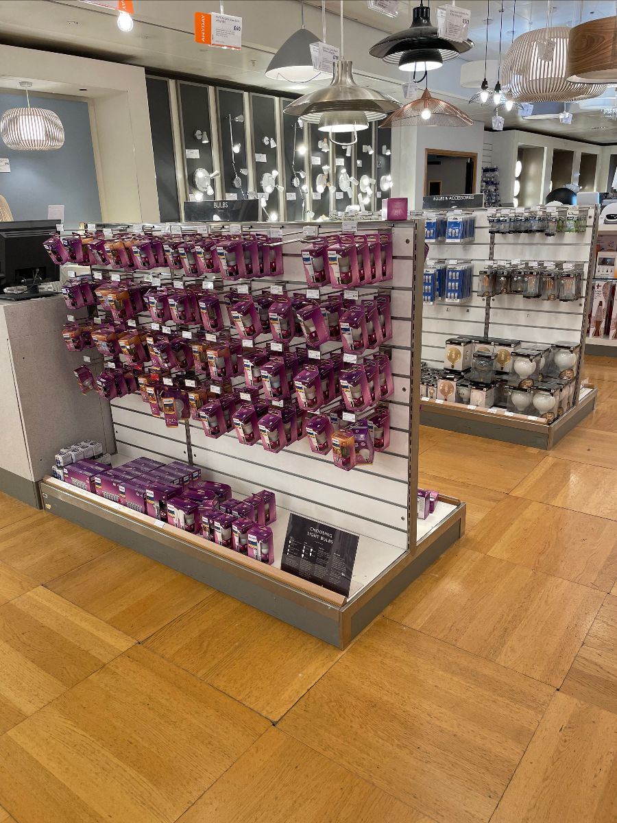
Leadership is also needed in Lightbulbs, the range is located within Lighting which makes at least sense.
However, signage is sorely needed for the customer, there's only one piece and it's much too small.
There has been so much change to the category with energy saving bulbs followed by LED, wattages changing then there's screw caps, bayonet etc etc.
This is precisely where you would source and stock harder to find bulbs and lighting filaments as it's a great thing to be renowned for. It would likely drive some loyalty too, to be fair, the John Lewis range was strong in this regard.
Improvements are purely around better shelf edge signage alongside overhead (or similar) to highlight the range too, it's really not that well signposted.
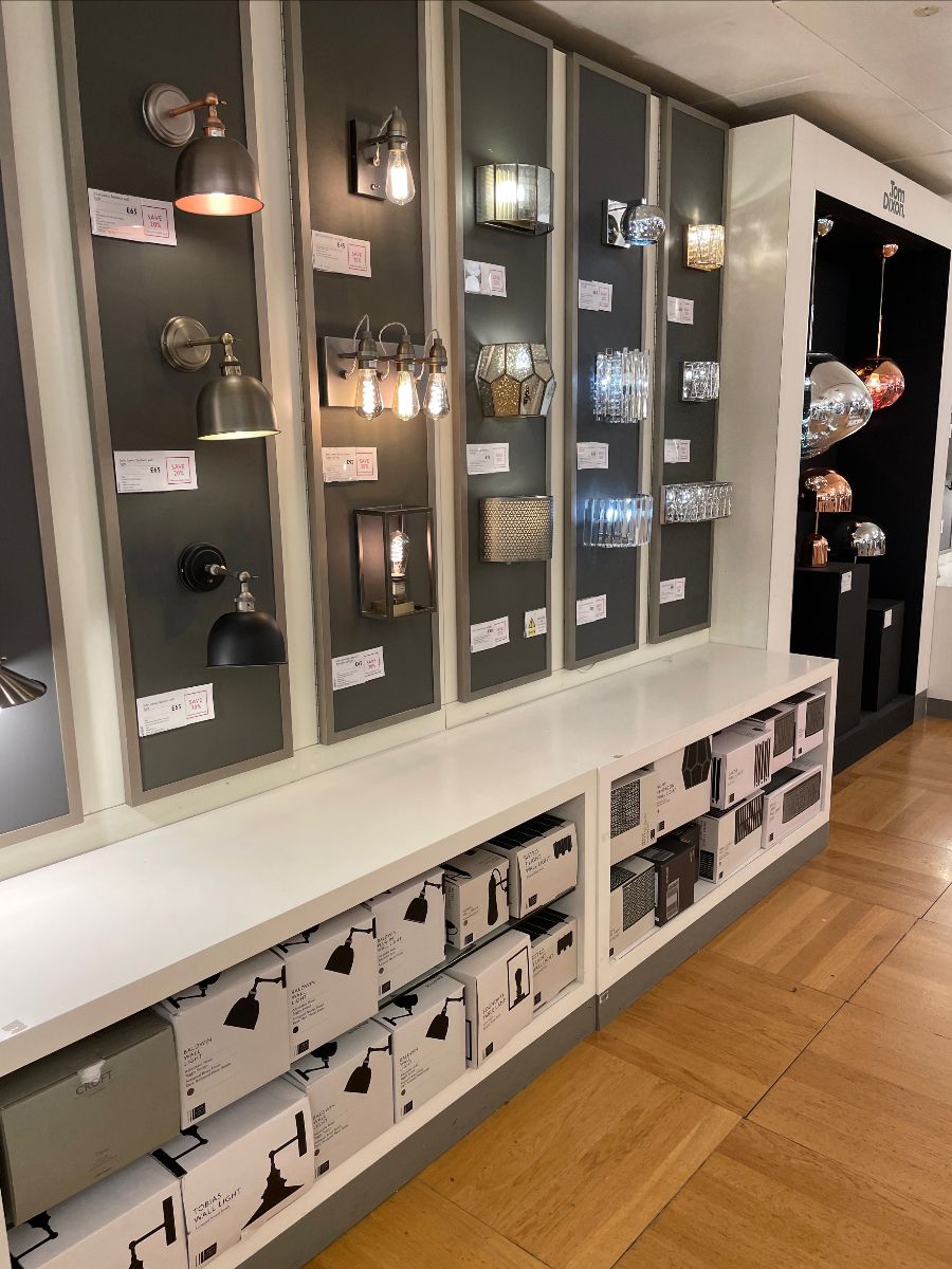
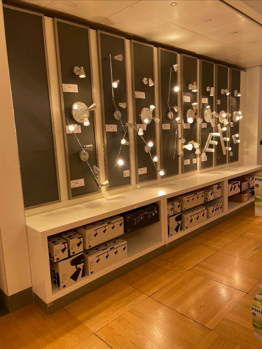
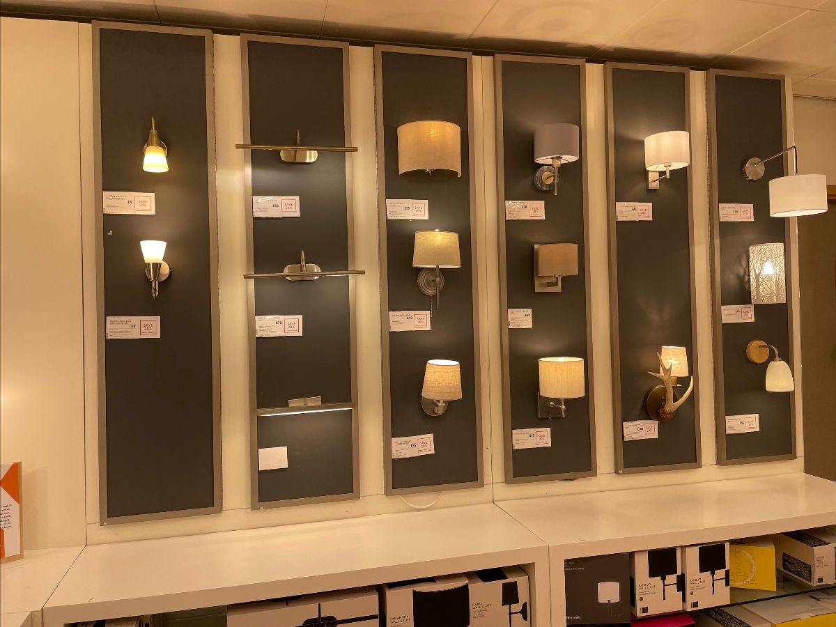
Wall lighting is both hard work to shop and indeed. look at. The range doesn't look appealing and it's hard to try and keep track of which light is which, based on the wall display and then the physical stock beneath.
The links between the two need to be better.
Fitting of lights on the display wall was also somewhat uneven; products weren't shown in the best light (ahem) due to the space and alignment to which they had been fitted. Some area of the display were entirely unused, also(?)
The product signage didn't talk enough about the light fittings; bar a smaller label that was on the fixture, there was nothing else. There wasn't any real grouping of product and trends weren't identified or highlighted either to the customer.
Could do better.
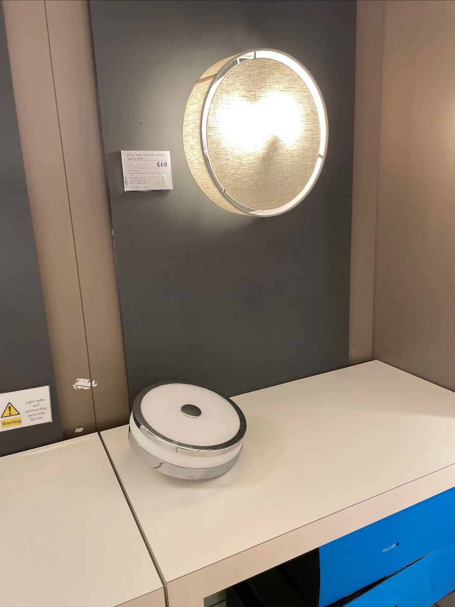
Not sure why one lighting unit is placed on the display top, not one you'd be looking to buy certainly.....
Product labelling really needs work. Talking to the customer is important and with partners not always around, product signage and point of sale needs to work twice as hard.
Remember that some customers don't really want to engage with a partner, they'd rather navigate things themselves, henceforth signage is even more important.
Further work to be done here, also.
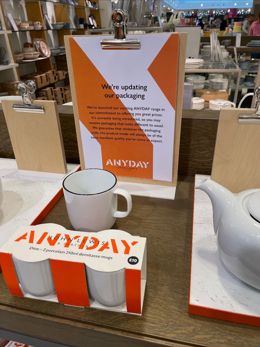
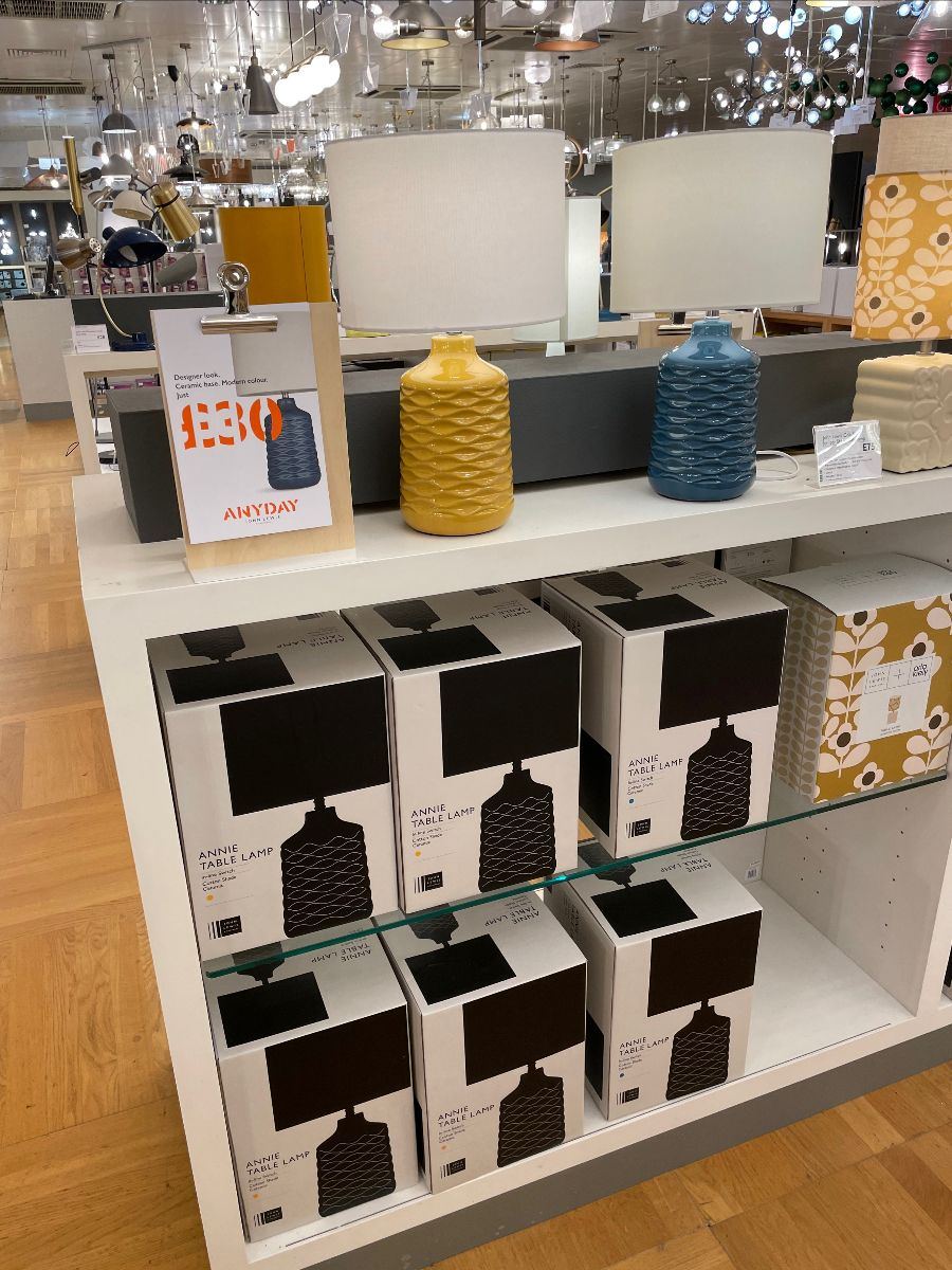
Anyday was also present in the lighting category and seemed to do nothing bar cause real confusion.
The difference in packaging (below) versus what was on display (eye level) was a challenge, different wording on the labels and product boxes was also a challenge.
To further add to the confusion; understanding whether a product was classed as Anyday or in fact was John Lewis branded (as the box suggested).
Yet signage at eye level showcased 'Anyday' and I spent a sizeable amount of time trying to work it out.
The boxes below relate to the product above; this indicates that the lamp is John Lewis branded and comes in Black. Right? Wrong!
No black lights were on display; whereas the colourful ones via Anyday (same design notably!) were displayed.
When looking closer; the John Lewis product box features a small coloured sticker which showed the the product was indeed the Anyday branded light above (note the yellow or blue dot just below the product description on box).
Why so confusing?
Why have "Anyday" here?
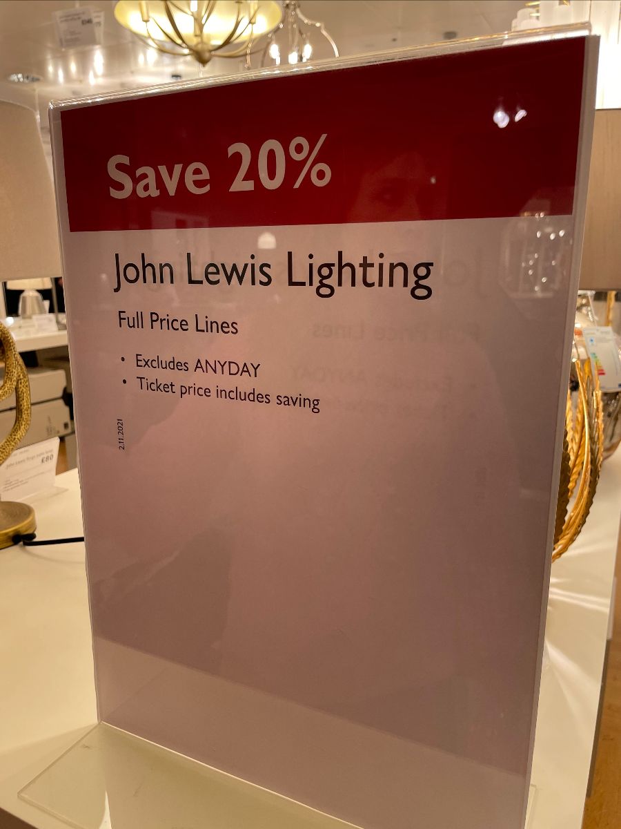
Whilst the Anyday / John Lewis issue felt like small fry, it became very messy, very quickly with a 20% off promotion active in Lighting.
On the face of it; a simple 20% off promotion was somehow so overworked and victim to the JLP self inflicted complexity that not even John Lewis knew which lines it was including in its own deal.
A couple of points here:
i) Why exclude Anyday from the deal when the range is branded as John Lewis and John Lewis lighting is the key headline on the signage? Anyday is John Lewis (features the JLP brand on pack)
ii) In the example above; how does anyone accurately classify that Light as Anyday? All of the boxes say "John Lewis" clearly, the only mention of "Anyday" is the signage on their own shelf.
iii) WIth the promotion highlighting that any shelf edge label will include the saving. It then looks like John Lewis are cherry picking savings. bar one sign, Anyday wasn't present on the £30 lamps, so it would mean this was a John Lewis product and thus, eligible for the discount?
Why so confusing?
You end up asking customers to play checkout roulette to see if the discount is applied.
Doesn't enhance trust at all.
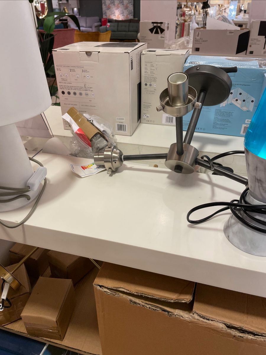
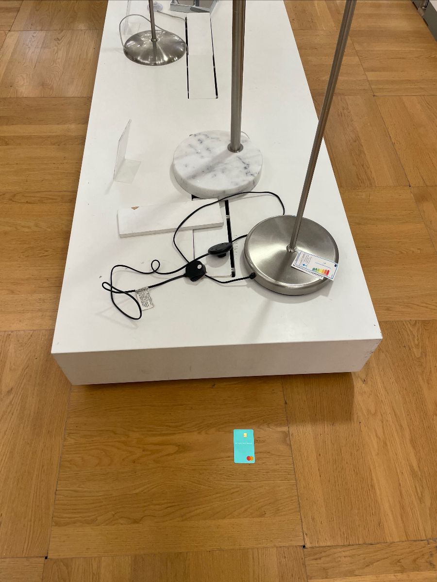
I picked up the credit card and handed it in; but this isn't a great example of a display here, with wires all over.... Why not hide them?
Or show the customer what can be done to hide. or tidy them via cable tidies etc?
It's where IKEA are so good, it's all real life. Selling a solution.
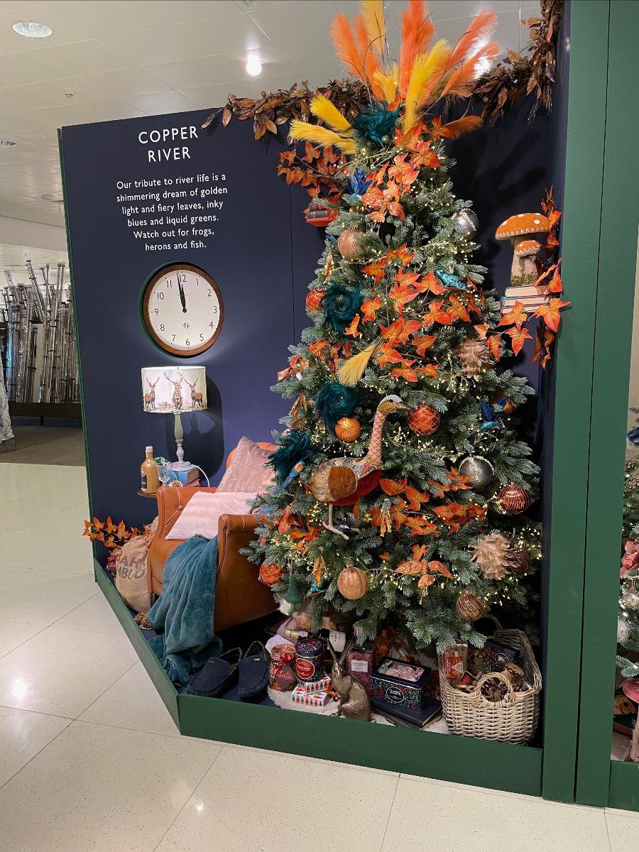
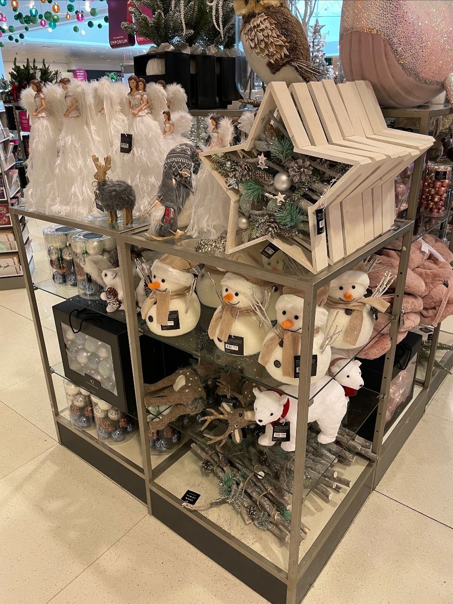
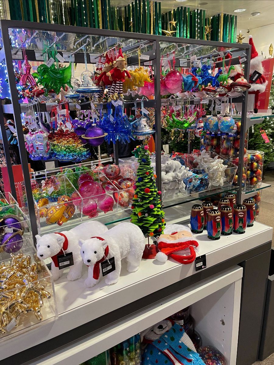
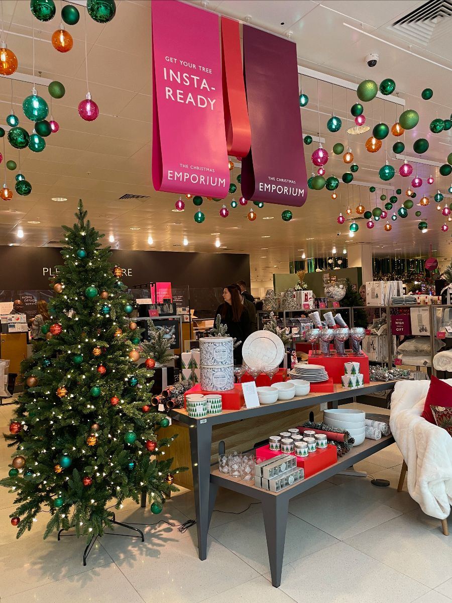
Yet the Christmas range and assortment is just wonderful. Caveat is that if you can't get this right as John Lewis then you're in trouble.....
But they've got it so right this year, like so many other years.
Lots of inspiration, collections, making things easier for customer when judging which lines go together on the Tree. The overhead signage with language around 'get your tree insta ready' reflects that customers want to decorate their tree for their Instagram, as well as themselves.
It's a great piece of work; an end to end event across decoration, homeware, gifting, wrap etc.
It really works well and highlights so much inspiration around what to do with the John Lewis collections and how to pull things together at Christmas.
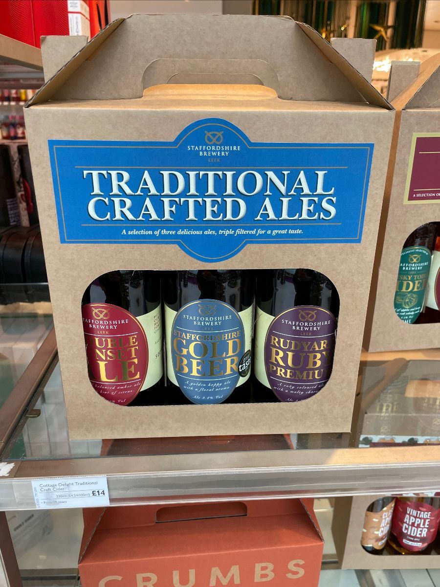
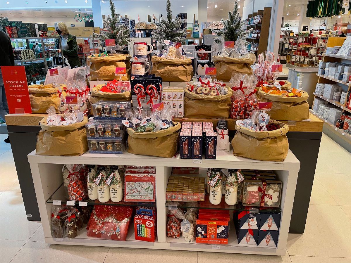
Gifting was spread out across a fair old space in store, perhaps reflecting the late arrival of stock that is plaguing the sector at the moment.
John Lewis took the mantle from Debenhams (may they RIP) for the hideously expensive Beer gift set (a mere £14 to you).
Their gifting display utilised paper sacks to merchandise stocking fillers and other food based gifts, this looked excellent. It's another reminder that John Lewis can indeed do visual merchandising, whilst pulling an offer together that will appeal to customers too.
Of course, it's easier to do this at Christmas; these principles need replicating around the store too.
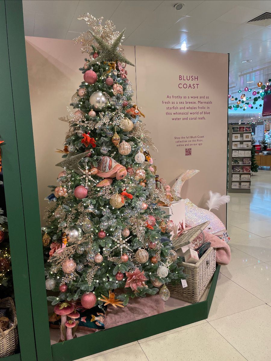
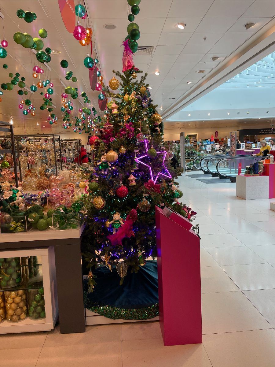
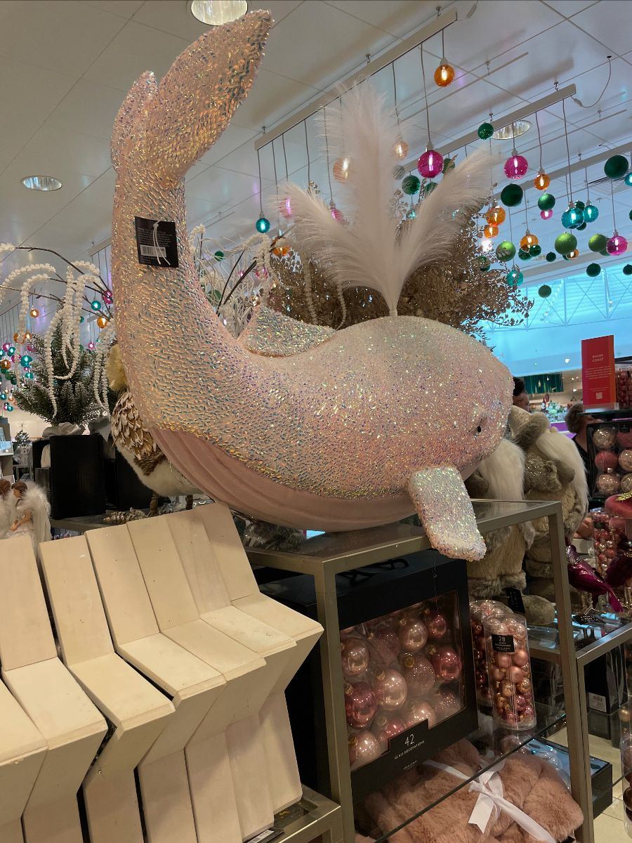
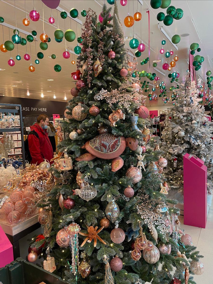
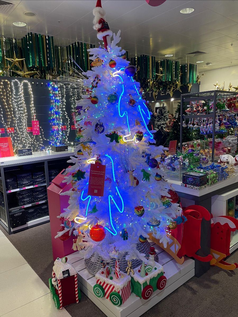
More of the tremendous Christmas offering here; a really great job by John Lewis. It flowed together so well and the festive area was justifiably busy with customers too.
This is where their quality speaks for itself. Around the depth of range, the fact that people want to gift John Lewis products and send John Lewis Christmas cards.
That speaks volumes.
The answer is within the partnership around how they need to progress their own offer.
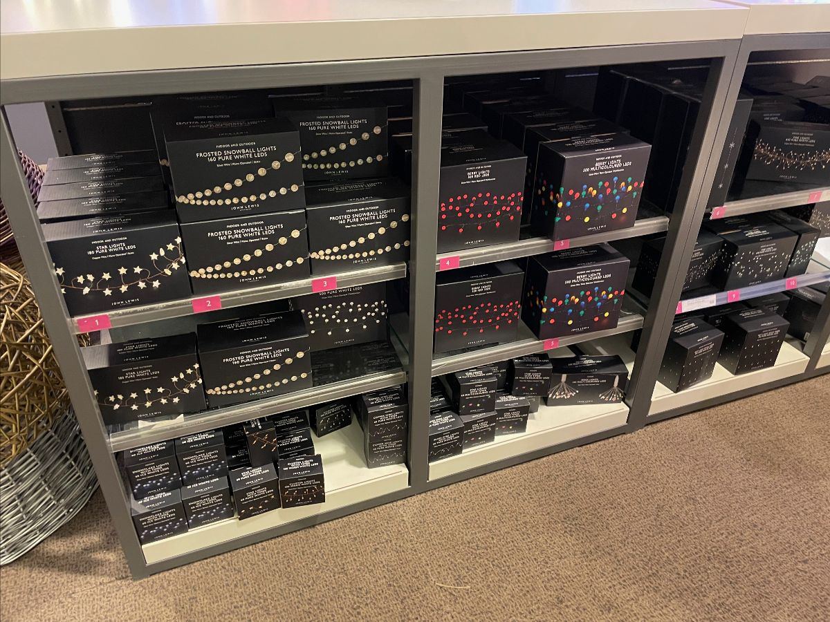
It wasn't all good news in Christmas. There was much confusion in Christmas lights as the store had displayed their numbered identifiers, aligning the product box with the lights (above and lit up) but inexplicably neglected to put the price out.
Again. I ask. How many managers and partners must have walked past the fixture and missed the absence of price tickets(?) How many sales have been lost as a result(?)
The basics, are so important and do play such a factor in the customers decision making. These factors are impossible to track as some of it will be in the subconscious of the customer anyway. Even they don't realise they're changing their mind based on a battered display, or a lack of price tickets.
Even though these factors can't be tracked, it doesn't make them any less important. Nor does it indicate that store standards do not matter.
If anything; it makes the retailing basics ever more important, given there's no direct customer feedback (bar my visits) to let anyone know of the issues faced in stores. Everyone sleeps better when the basics around ticketing and basic retailing standards are taken care of.
To conclude; within John Lewis, there is a wonderful retailer who has so many stories to tell, so many products to trade, highlight and share alongside solutions to solve the customers problems.
But JLP are too busy getting tied up with their own problems instead.
Anyday is starting to look like a botched roll out with the existing product still sat around the fixture, which just adds to the confusion.
Then you a disaster on a seemingly simple 20% off promotion in Lighting, with the myriad of own brands (controlled by John Lewis) confusing matters further.
The overriding thought I have with many retailers, but for John Lewis, it's 100% accurate.
The only thing that's consistent about John Lewis is their inconsistency.
Subscribe today to benefit from our world class insight.
Forward our note on John Lewis to your colleagues
From the Grocery Insight newsletter archive, first sent to subscribers on 4 November 2021. Steve now writes at read.groceryinsight.com. See also the blog archive and briefings.